

Item
Row of media, text and actions for lists and settings.
A row of content: media on one side, a title and description in the middle, actions on the other.
It is the shape almost every list in an app already has — a settings row, a file in a picker, a member in a team list, a tool call in a transcript — so it exists as one composable primitive instead of being rebuilt per screen with slightly different padding each time.
Installation
Item ships with the library — no separate install.
import { Item, Avatar, Badge, Button, Switch, Text, ReceiptIcon, BellIcon, ChevronRightIcon, PackageIcon } from 'panelui-native';Or copy the source into your project, to own and edit it:
npx panelui-cli@latest add itemUsage
<Item variant="outline">
  <Item.Media variant="icon">
    <ReceiptIcon size={18} />
  </Item.Media>
  <Item.Content>
    <Item.Title>Invoice.pdf</Item.Title>
    <Item.Description>2.4 MB · Updated yesterday</Item.Description>
  </Item.Content>
  <Item.Actions>
    <Button size="sm" variant="outline">Open</Button>
  </Item.Actions>
</Item>

// Pressable rows. Without onPress it renders as a plain view and does not
// announce itself as a button.
<Item.Group>
  <Item size="sm" onPress={() => open(file)}>
    <Item.Content>
      <Item.Title>Notifications</Item.Title>
      <Item.Description>Push, email and in-app</Item.Description>
    </Item.Content>
    <Item.Actions>
      <ChevronRightIcon size={16} />
    </Item.Actions>
  </Item>
  <Item.Separator />
  <Item size="sm" onPress={() => open(privacy)}>
    <Item.Content>
      <Item.Title>Privacy</Item.Title>
    </Item.Content>
  </Item>
</Item.Group>
Composition
<Item.Group>
  <Item>
    <Item.Header>…</Item.Header>
    <Item.Media>…</Item.Media>
    <Item.Content>
      <Item.Title>…</Item.Title>
      <Item.Description>…</Item.Description>
    </Item.Content>
    <Item.Actions>…</Item.Actions>
    <Item.Footer>…</Item.Footer>
  </Item>
  <Item.Separator />
</Item.Group>Item.Group— Stack of rows. Announces itself as a list.Item.Separator— Hairline between rows in a group.Item.Media— Leading slot — an icon tile, a thumbnail, or an avatar passed straight through.Item.Content— The text column. Takes the remaining width so actions stay pinned to the trailing edge.Item.Title— Primary line. Its size follows the item.Item.Description— Secondary line, muted. Its size follows the item.Item.Actions— Trailing slot — buttons, a chevron, a switch.Item.Header— Full-width strip above the row content. Needs the item laid out as a column.Item.Footer— Full-width strip below the row content.
Examples
A file row
<Item variant="outline">
  <Item.Media variant="icon">
    <ReceiptIcon size={18} />
  </Item.Media>
  <Item.Content>
    <Item.Title>Invoice.pdf</Item.Title>
    <Item.Description>2.4 MB · Updated yesterday</Item.Description>
  </Item.Content>
  <Item.Actions>
    <Button size="sm" variant="outline">Open</Button>
  </Item.Actions>
</Item>
A settings group
Give a row onPress and it becomes a pressable with a press animation and a button role. Leave it off and it stays a plain view.
<Item.Group>
  {rows.map((row, index) => (
    <Fragment key={row.id}>
      {index > 0 && <Item.Separator />}
      <Item size="sm" onPress={() => router.push(row.href)}>
        <Item.Content>
          <Item.Title>{row.title}</Item.Title>
          <Item.Description>{row.summary}</Item.Description>
        </Item.Content>
        <Item.Actions>
          <ChevronRightIcon size={16} />
        </Item.Actions>
      </Item>
    </Fragment>
  ))}
</Item.Group>
Media types
icon and image give the media slot a sized box; the default adds none, so an Avatar can style itself.
<Item.Media variant="icon"><BellIcon size={18} /></Item.Media>

<Item.Media variant="image">
  <Image source={{ uri: product.image }} className="h-full w-full" />
</Item.Media>

<Item.Media>
  <Avatar size="md" source={{ uri: user.avatar }} fallback="KA" />
</Item.Media>
With a switch
Keep the row non-pressable when the control is the only target — two overlapping press areas is a bad row.
<Item size="sm">
  <Item.Content>
    <Item.Title>Push notifications</Item.Title>
    <Item.Description>Alerts on this device.</Item.Description>
  </Item.Content>
  <Item.Actions>
    <Switch value={push} onValueChange={setPush} />
  </Item.Actions>
</Item>
A horizontal group of cards
Two independent axes. orientation on the group runs the items across the screen instead of down it; orientation on each item stacks its own parts into a card. A carousel wants both.
<ScrollView horizontal showsHorizontalScrollIndicator={false}>
  <Item.Group orientation="horizontal">
    {plans.map((plan) => (
      <Item
        key={plan.id}
        orientation="vertical"
        variant="outline"
        className="w-48"
      >
        <Item.Media variant="icon">
          <PackageIcon size={18} />
        </Item.Media>
        <Item.Content>
          <Item.Title>{plan.name}</Item.Title>
          <Item.Description>{plan.summary}</Item.Description>
        </Item.Content>
        <Item.Footer>
          <Text weight="semibold">{plan.price}</Text>
        </Item.Footer>
      </Item>
    ))}
  </Item.Group>
</ScrollView>
A vertical item
orientation="vertical" is also what Item.Header and Item.Footer need — both are full-width strips, so they only make sense once the item stacks.
<Item orientation="vertical" variant="outline">
  <Item.Header>
    <Badge variant="secondary">Draft</Badge>
    <Text size="xs" muted>Updated 2h ago</Text>
  </Item.Header>
  <Item.Content>
    <Item.Title>Quarterly report</Item.Title>
    <Item.Description>Revenue, retention and headcount.</Item.Description>
  </Item.Content>
  <Item.Footer>
    <Button size="sm" variant="outline">Preview</Button>
    <Button size="sm">Publish</Button>
  </Item.Footer>
</Item>
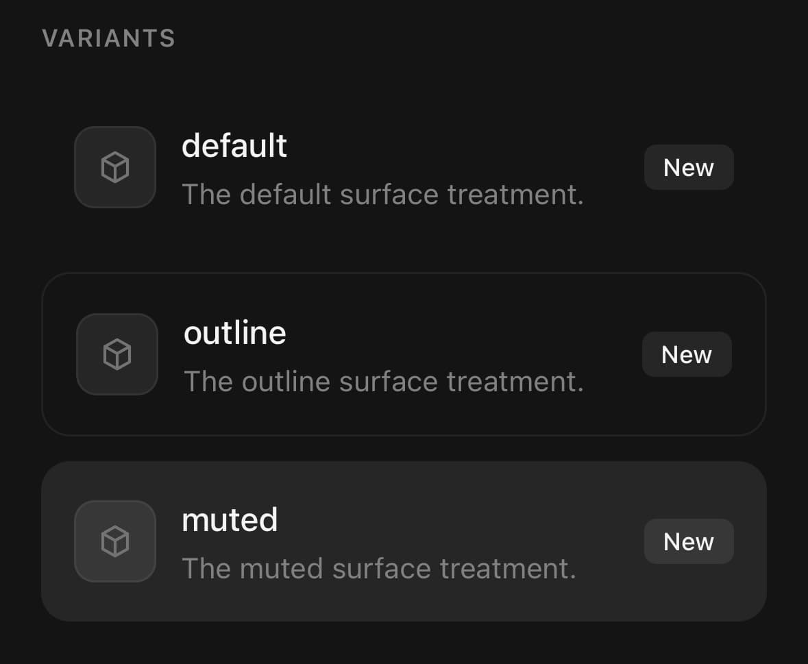
Variants
variant
default(default)outlinemuted
<Item variant="default">…</Item>
<Item variant="outline">…</Item>
<Item variant="muted">…</Item>
size
default(default)smxs
{/* Sets the row padding, and the media, title and description sizes. */}
<Item size="default">…</Item>
<Item size="sm">…</Item>
<Item size="xs">…</Item>
orientation
horizontal(default)vertical
{/* The list row — media, text and actions side by side. */}
<Item orientation="horizontal">…</Item>

{/* Stacked into a card, for a carousel or for Header/Footer. */}
<Item orientation="vertical">…</Item>

{/* The group has its own axis, independent of the items' own. */}
<Item.Group orientation="horizontal">…</Item.Group>
API Reference
Item
| Prop | Type | Default | Description |
|---|---|---|---|
className | string | — | |
disabled | boolean | — | |
size | ItemSize | default | Row density. Item.Media, Item.Title and Item.Description follow it, so it only needs setting here. |
orientation | ItemOrientation | horizontal | horizontal is the list row: media, text and actions side by side. vertical stacks them into a card, which is what a horizontal carousel wants — and it is also what Item.Header and Item.Footer need, since both are full-width strips. |
Item.Group
| Prop | Type | Default | Description |
|---|---|---|---|
className | string | — | |
orientation | ItemOrientation | horizontal | vertical stacks the items — the settings-list shape. horizontal runs them across instead, for a carousel; pair it with a scrollable and orientation="vertical" on each item so every entry reads as a card. |
Item.Separator
| Prop | Type | Default | Description |
|---|---|---|---|
className | string | — | |
orientation | ItemOrientation | horizontal | Match the group's axis: a horizontal group needs vertical hairlines. |
Item.Media
| Prop | Type | Default | Description |
|---|---|---|---|
className | string | — |
Item.Content
| Prop | Type | Default | Description |
|---|---|---|---|
className | string | — |
Item.Title
| Prop | Type | Default | Description |
|---|---|---|---|
className | string | — |
Item.Description
| Prop | Type | Default | Description |
|---|---|---|---|
className | string | — |
Item.Actions
| Prop | Type | Default | Description |
|---|---|---|---|
className | string | — |
Item.Header
| Prop | Type | Default | Description |
|---|---|---|---|
className | string | — |
Item.Footer
| Prop | Type | Default | Description |
|---|---|---|---|
className | string | — |
Every part also accepts the underlying React Native props (ViewProps or TextProps) and a className for Tailwind utilities.
Notes
Pressable or not
Give the item an onPress and it renders as an AnimatedPressable with accessibilityRole="button" and a press animation. Leave it off and it renders as a plain View — a static row should not announce itself as a button. React Native has no render-as-link escape hatch, so this is the substitute for one.
Density
size is set once on the item. Item.Media, Item.Title and Item.Description read it from context, so the icon tile, title size and description size all move together. Override any of them individually by passing size or className to that part.
The two axes
orientation means something different on the item and on the group, and they are independent:
- On
Itemit decides whether the item's own parts sit side by side (horizontal, the default list row) or stack (vertical, a card). - On
Item.Groupit decides whether the items run down the screen (vertical, the default) or across it (horizontal, a carousel).
Item.Header and Item.Footer are full-width strips, so they need orientation="vertical" on the item. Item.Separator takes the prop too — a horizontal group needs vertical hairlines.