

Message
Chat turn with avatar, bubble, header and footer.
A chat turn: avatar, bubble, and the metadata around it.
The pieces are separate because conversations differ in which ones they need. A support thread wants a sender name and a read receipt; an assistant transcript wants neither, but does want the bubble to carry tool output and actions.
Installation
Message ships with the library — no separate install.
import { Message, Avatar, Button, Shimmer } from 'panelui-native';Or copy the source into your project, to own and edit it:
npx panelui-cli@latest add messageUsage
<Message>
  <Message.Avatar>
    <Avatar size="sm" fallback="KA" />
  </Message.Avatar>
  <Message.Content>
    <Message.Bubble>
      <Message.BubbleContent>How can I help you today?</Message.BubbleContent>
    </Message.Bubble>
  </Message.Content>
</Message>

// The outgoing side.
<Message align="end">
  <Message.Content>
    <Message.Bubble>
      <Message.BubbleContent>Set a reminder for 9am.</Message.BubbleContent>
    </Message.Bubble>
    <Message.Footer>Read</Message.Footer>
  </Message.Content>
</Message>

// Consecutive turns from one sender.
<Message.Group align="start">
  <Message>
    <Message.Avatar><Avatar size="sm" fallback="AI" /></Message.Avatar>
    <Message.Content>
      <Message.Header>Assistant</Message.Header>
      <Message.Bubble>
        <Message.BubbleContent>Looking that up…</Message.BubbleContent>
      </Message.Bubble>
    </Message.Content>
  </Message>
  <Message>
    <Message.Avatar><Avatar size="sm" fallback="AI" /></Message.Avatar>
    <Message.Content>
      <Message.Bubble>
        <Message.BubbleContent>Your reminder is set.</Message.BubbleContent>
      </Message.Bubble>
    </Message.Content>
  </Message>
</Message.Group>
Composition
<Message.Group>
  <Message align="start">
    <Message.Avatar>…</Message.Avatar>
    <Message.Content>
      <Message.Header>…</Message.Header>
      <Message.Bubble>
        <Message.BubbleContent>…</Message.BubbleContent>
      </Message.Bubble>
      <Message.Actions>…</Message.Actions>
      <Message.Footer>…</Message.Footer>
    </Message.Content>
  </Message>
</Message.Group>Message.Group— Consecutive turns from one sender. Tightens spacing and stacks them.Message.Avatar— Slot for the sender avatar. Reserved but emptied on a stacked message.Message.Content— Column holding the header, bubble, actions and footer.Message.Header— Sender name or timestamp above the bubble.Message.Bubble— The speech bubble. Takes its colour and squared corner from align.Message.BubbleContent— Text inside the bubble, in whichever colour reads against it.Message.Footer— Delivery state or timestamp below the bubble.Message.Actions— Row of controls under the bubble — copy, retry, feedback.
Examples
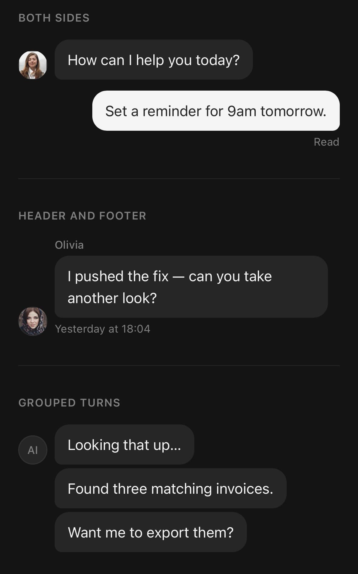
Both sides of a conversation
align decides the row direction, the avatar side, which bubble corner is squared off, and the bubble colour — every part reads it from context.
<Message>
  <Message.Avatar>
    <Avatar size="sm" source={{ uri: them.avatar }} fallback="OL" />
  </Message.Avatar>
  <Message.Content>
    <Message.Bubble>
      <Message.BubbleContent>How can I help you today?</Message.BubbleContent>
    </Message.Bubble>
  </Message.Content>
</Message>

<Message align="end">
  <Message.Content>
    <Message.Bubble>
      <Message.BubbleContent>Set a reminder for 9am.</Message.BubbleContent>
    </Message.Bubble>
    <Message.Footer>Read</Message.Footer>
  </Message.Content>
</Message>
Grouped turns
Every turn after the first is marked stacked: it keeps its avatar slot but empties it, so the bubbles stay in one column.
<Message.Group align="start">
  {turns.map((turn) => (
    <Message key={turn.id}>
      <Message.Avatar>
        <Avatar size="sm" fallback="AI" />
      </Message.Avatar>
      <Message.Content>
        <Message.Bubble>
          <Message.BubbleContent>{turn.text}</Message.BubbleContent>
        </Message.Bubble>
      </Message.Content>
    </Message>
  ))}
</Message.Group>
A streaming turn
<Message>
  <Message.Avatar><Avatar size="sm" fallback="AI" /></Message.Avatar>
  <Message.Content>
    <Message.Bubble>
      {text ? (
        <Message.BubbleContent>{text}</Message.BubbleContent>
      ) : (
        <Shimmer textClassName="text-base">Thinking…</Shimmer>
      )}
    </Message.Bubble>
  </Message.Content>
</Message>
Actions under the bubble
Message.Actions reverses its row on the outgoing side so the buttons stay on the message’s own edge.
<Message.Content>
  <Message.Bubble>
    <Message.BubbleContent>{answer}</Message.BubbleContent>
  </Message.Bubble>
  <Message.Actions>
    <Button size="sm" variant="ghost" onPress={() => copy(answer)}>Copy</Button>
    <Button size="sm" variant="ghost" onPress={retry}>Retry</Button>
  </Message.Actions>
</Message.Content>
In a transcript
An inverted FlatList keeps the newest turn pinned to the bottom without measuring content, and recycles rows as the conversation grows.
<FlatList
  data={[...messages].reverse()}
  inverted
  keyExtractor={(m) => m.id}
  contentContainerClassName="gap-3 px-4 py-3"
  renderItem={({ item }) => (
    <Message align={item.role === 'user' ? 'end' : 'start'}>
      <Message.Content>
        <Message.Bubble>
          <Message.BubbleContent>{item.text}</Message.BubbleContent>
        </Message.Bubble>
      </Message.Content>
    </Message>
  )}
/>
Variants
align
start(default)end
{/* Incoming — muted bubble, avatar on the left. */}
<Message align="start">…</Message>

{/* Outgoing — primary bubble, row reversed. */}
<Message align="end">…</Message>

{/* Or set it once for a whole group. */}
<Message.Group align="end">…</Message.Group>
API Reference
Message
| Prop | Type | Default | Description |
|---|---|---|---|
className | string | — | |
align | Align | start | Which side of the conversation this turn belongs to. end is the outgoing side — the person holding the device. |
stacked | boolean | — | Continuation of the message above it: tighter spacing, and the avatar slot is reserved but left empty so bubbles stay aligned. Message.Group sets this for you. |
Message.Group
| Prop | Type | Default | Description |
|---|---|---|---|
className | string | — | |
align | Align | start | Alignment applied to every Message inside that does not set its own. |
Message.Avatar
| Prop | Type | Default | Description |
|---|---|---|---|
className | string | — |
Message.Content
| Prop | Type | Default | Description |
|---|---|---|---|
className | string | — |
Message.Header
| Prop | Type | Default | Description |
|---|---|---|---|
className | string | — |
Message.Bubble
| Prop | Type | Default | Description |
|---|---|---|---|
className | string | — |
Message.BubbleContent
| Prop | Type | Default | Description |
|---|---|---|---|
className | string | — |
Message.Footer
| Prop | Type | Default | Description |
|---|---|---|---|
className | string | — |
Message.Actions
| Prop | Type | Default | Description |
|---|---|---|---|
className | string | — |
Every part also accepts the underlying React Native props (ViewProps or TextProps) and a className for Tailwind utilities.
Notes
Alignment
align is the only decision the root makes, and every part reads it from context: which side the row sits on, which way the avatar goes, which corner of the bubble is squared off, and which colour it takes. start is incoming (muted bubble), end is outgoing (primary bubble).
Set it on Message.Group instead and every message inside inherits it.
Grouping
Message.Group marks every turn after the first as stacked. A stacked message still renders its avatar slot but leaves it empty, so the bubbles stay in one column instead of the second sliding under the first one's avatar. Pass stacked on a message explicitly to override that.
In a list
Render a transcript with an inverted FlatList, not a ScrollView — it keeps the newest turn pinned to the bottom without measuring content, and recycles rows as the conversation grows.